Wyckoff wasn’t just about theories and principles, he gave us a practical roadmap too!
His accumulation and distribution schematics break down complex market phases into bite-sized chunks, making it easier to spot opportunities and time your entries.
These schematics consist of five mini-phases, neatly labeled A through E.
Each follows the other, like a chain reaction, reflecting the natural cause-and-effect flow of the market. We also have Wyckoff events – specific price movements that serve a purpose within the accumulation or distribution phase (such as a Buying Climax!).
Wyckoff Accumulation Schematic Breakdown
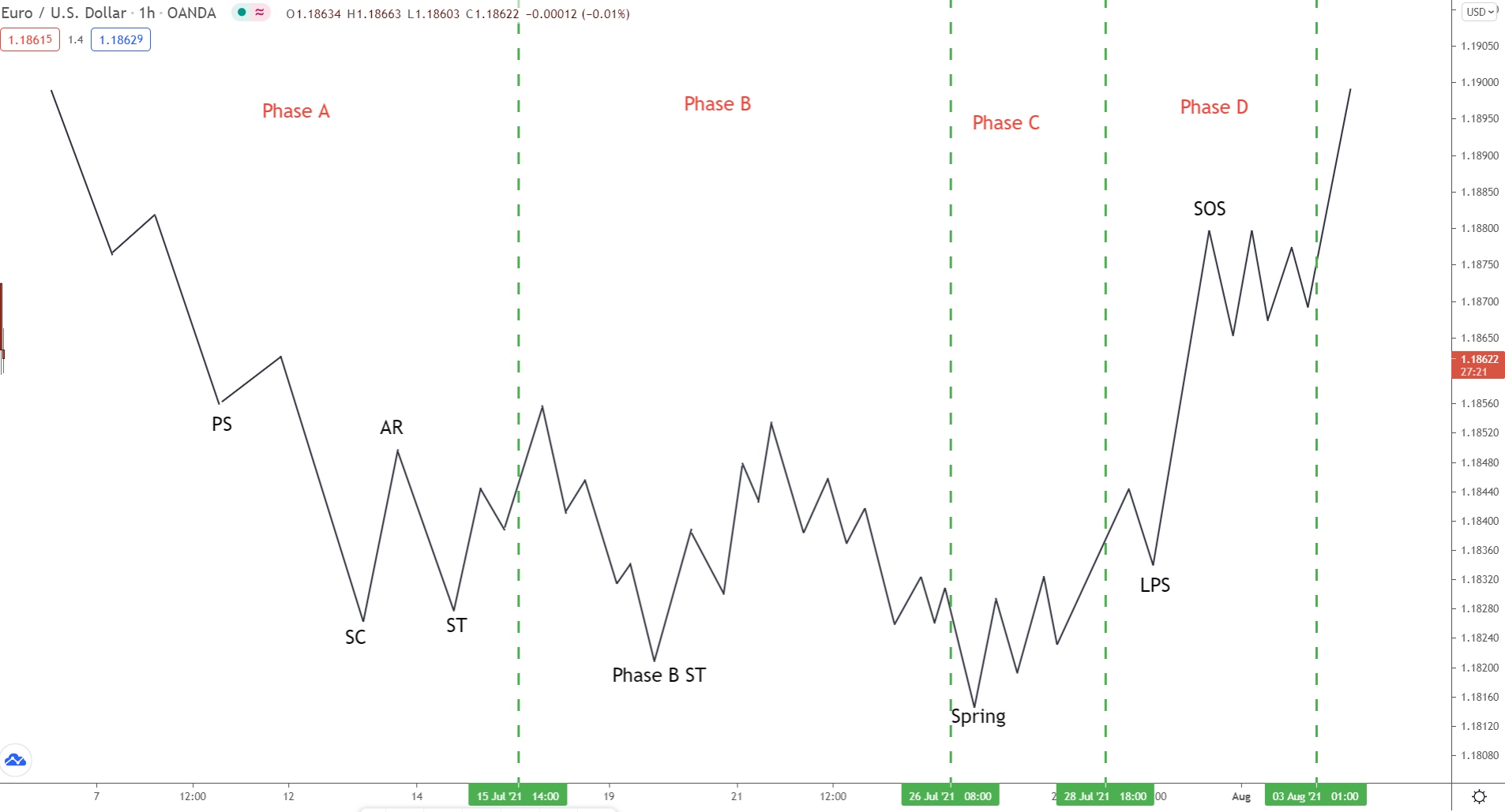
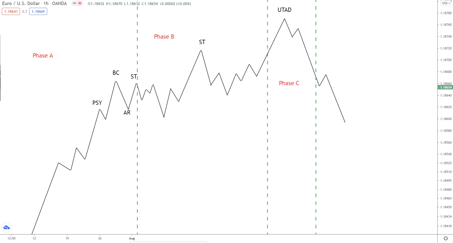
Phase A
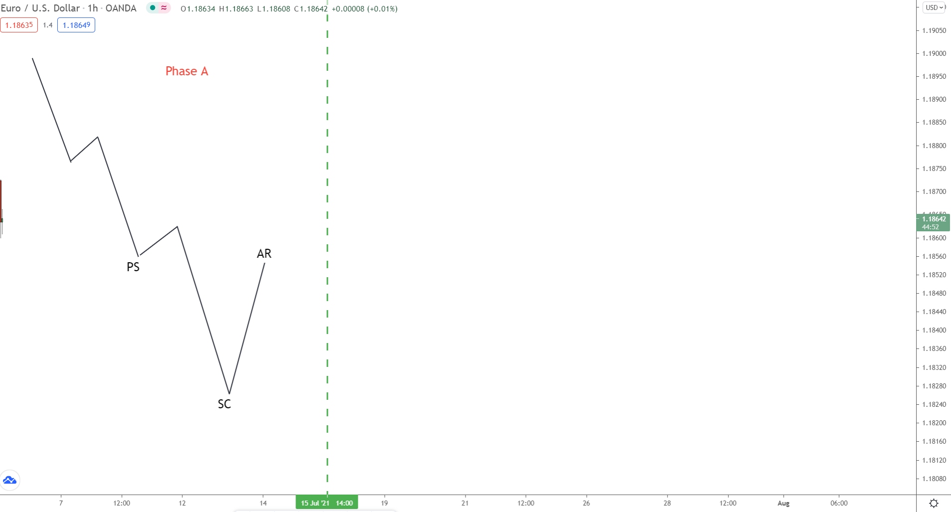
During phase A, we see the selling pressure decrease. Price, which has been in a long downtrend, starts to slow, with more buyers now entering. Evidence for this appears at preliminary support (PS) – a small retracement created by buyers jumping in.
To most traders, the trend looks set to continue.
But some clues are starting to appear that suggest a reversal.
After another swing lower, price reverses.
This creates a low called the selling climax (SC).
Marked by intense selling activity, the selling climax shows the sellers pushed price lower but came up against inspired buyers. During the whole move, the buyers and sellers battle for control.
The result being especially high volatility – big candles/wicks and high volume.
Ultimately, price does fall…
However, it took so many sellers that none are around to sustain the move.
That’s why we see the SC form followed by an accelerated move higher (AR).
The AR begins because the buyers bought up all the sellers during the climax. The sellers thought they were winning, but they weren’t!
The buyers (big players) were just using their sell orders to buy for their own purposes.
Once the sellers were bought up, price could only rise – no sellers were around!
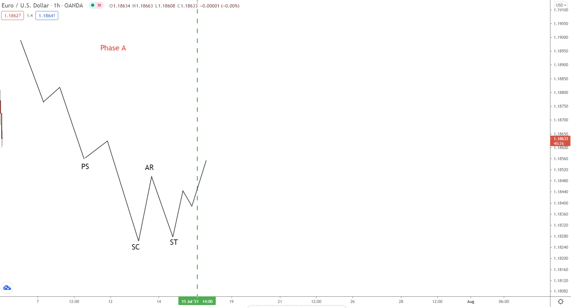
After the automatic reaction (AR), we see another decline.
Known as the secondary test (ST), this decline probes how many sellers still exist and, by extension, if the downtrend could continue.
Compared to the (SC), the secondary test will usually (but not always) form a higher low. The volume and general volatility will also be lower, with smaller candlesticks appearing and lower volume on bearish candles.
Onto phase B now…
Phase B
In phase B, we see the consolidation begin.
Now the accumulation gets underway, and the big players start gradually building a large buy position to initiate the mark-up phase later. In Wyckoff’s laws, the consolidation (accumulation) is the cause that leads to the effect (markup).
Key Point…
During phase B, multiple secondary tests (ST) will take place – they must!
The big players can only buy when others are selling, i.e when the tests occur.
Each test represents them entering another small trade for the mark-up phase.
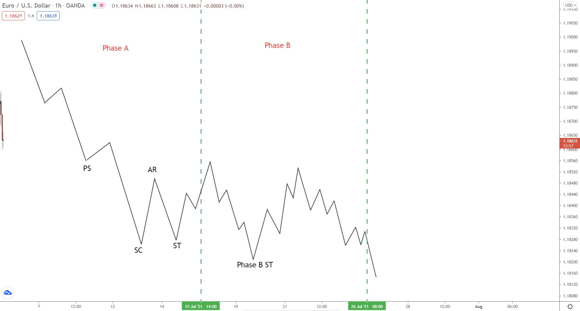
These tests come in many varieties; some create higher lows, others lower lows.
However, the one constant between them…
ALL will form at similar prices.
This is so the big players can replicate entering one trade at a single price.
Most of the time, that’s not possible – they never have enough sellers free.
To compensate, they enter multiple small trades at similar prices – that simulates entering one big trade at a single price.
Phase C
Phase C is where we see the initial signs a markup phase could be near, owing to the fact a spring usually pushes price below the consolidation low.
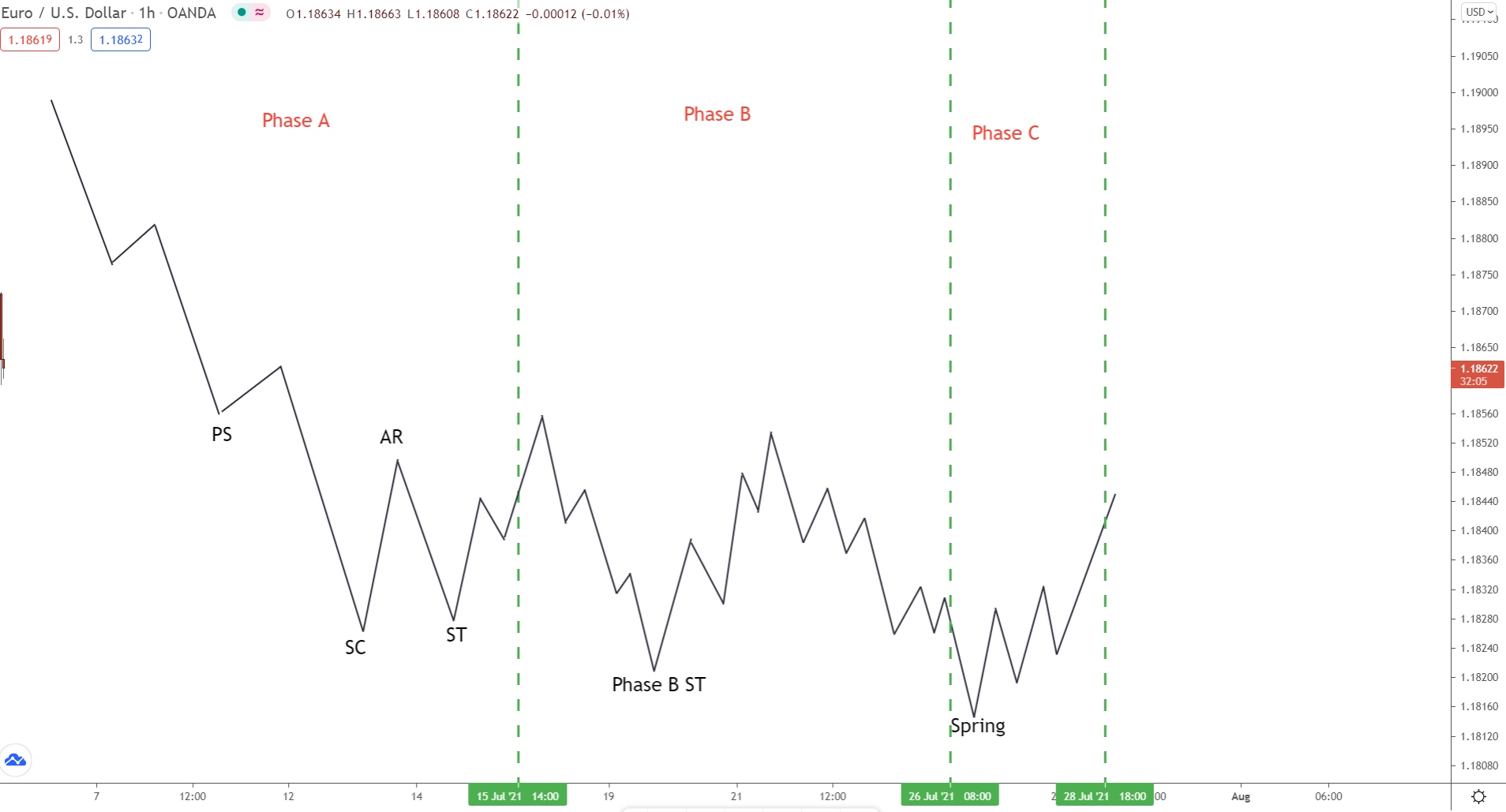
In Wyckoff’s studies, the spring is basically a bear trap designed to shake out any leftover shorts and trap them into fueling the incoming markup phase. When price breaks lower, the shorts jump in – they think the downtrend is resuming.
The big players then buy, causing price to rise.
The shorts are now trapped in losing sell trades.
The only way they can exit these trades is by closing, which means they must buy.
If thousands of traders unknowingly buy, what happens to price?
It rises! Price drives higher!
That’s what happens after the spring completes – the trapped shorts close via buying, resulting in a sharp move higher.
The whole point of the spring is to trap, stop out, and mislead traders.
The big players use the opportunity to enter massive buy trades. The shorts jumping in and longs being stopped out provides them with masses of sell orders, which they use to buy with. It is a final way to flush out any weak holders before the new uptrend begins (markup phase).
Keep in mind:
Even though the spring is important, it’s not essential…
Sometimes, price will continue to consolidate, and no spring will form.
In these cases, another accumulation schematic could be underway. The spring might not feature, but the phases and order they occur will be identical.
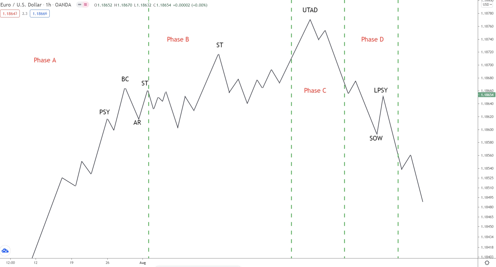
Phase D
Phase D is where we see really see the ball get rolling.
Here, the transition between the accumulation and mark up phase begins.
We see a sharp rise from the spring, usually accompanied by a notable increase in volume. Big candlesticks start to appear, with wicks forming underneath – a sign bulls are eager to buy whenever lower prices are present.
Last point support (LPS) will form some way into the move, confirming upside strength and providing support if price falls lower.
Multiple last point support levels can (and will) form during the rise.
These normally appear right before price breaks a resistance level, acting as support.
The break of these levels creates higher highs, further signs of strength (SOS) for the move.
Phase E (Final Phase)
And finally, phase E.
Here we see the full transition from the accumulation phase (consolidation) to the markup phase (new uptrend).
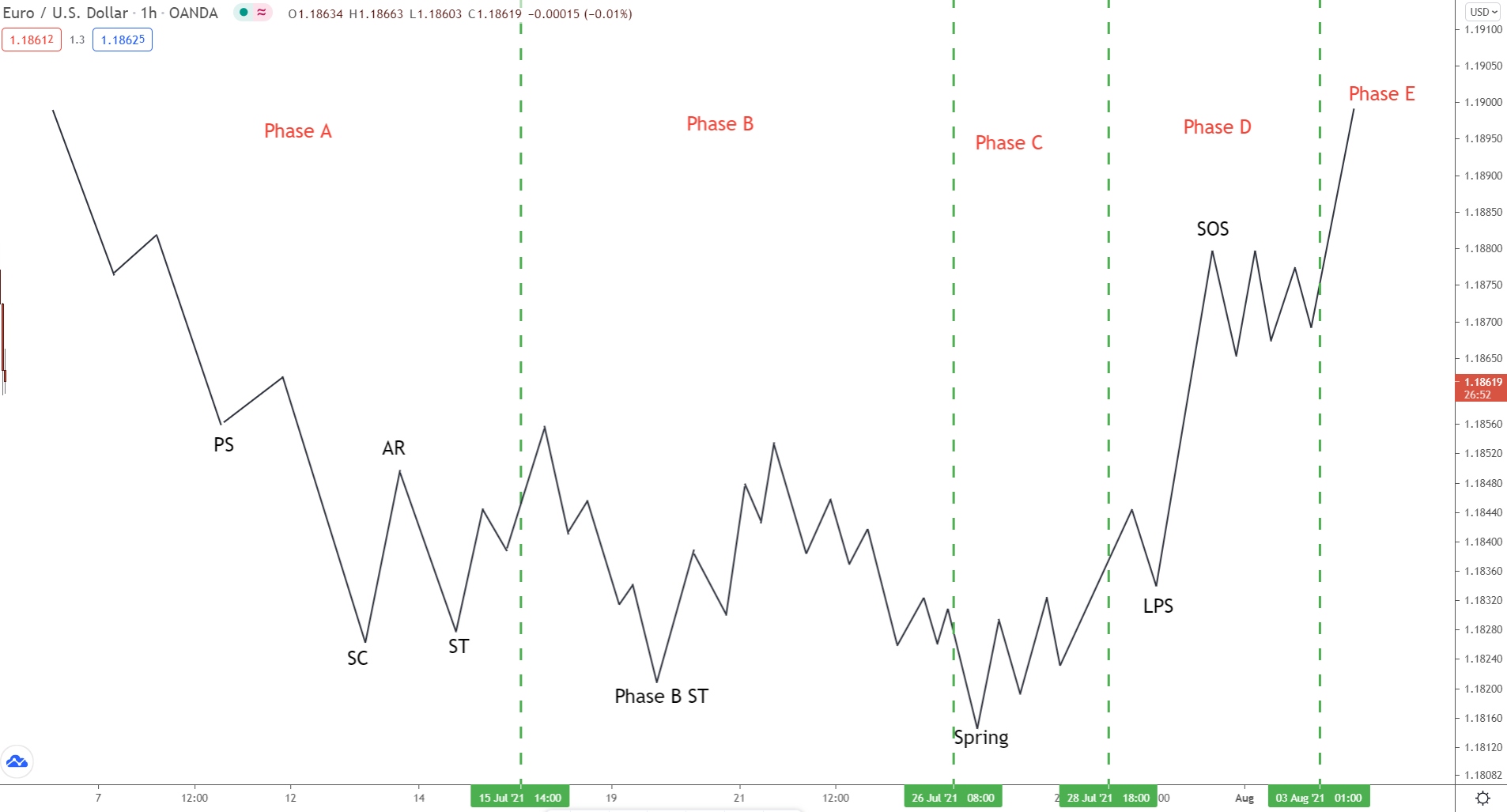
Once price breaks out of the consolidation, the markup stage is considered underway, and higher highs and higher lows should begin forming.
Now the new uptrend is confirmed, you can begin watching for long entries.
Wyckoff Distribution Schematic
The accumulation and distribution phases are really two sides of the same coin.
Structurally, they are the same, only upside down. Each schematic phase completes the same way but with slightly different terms – rather than beginning with a downtrend, phase A starts with an uptrend, for example.
Here’s a quick breakdown of the phases…
Phase A
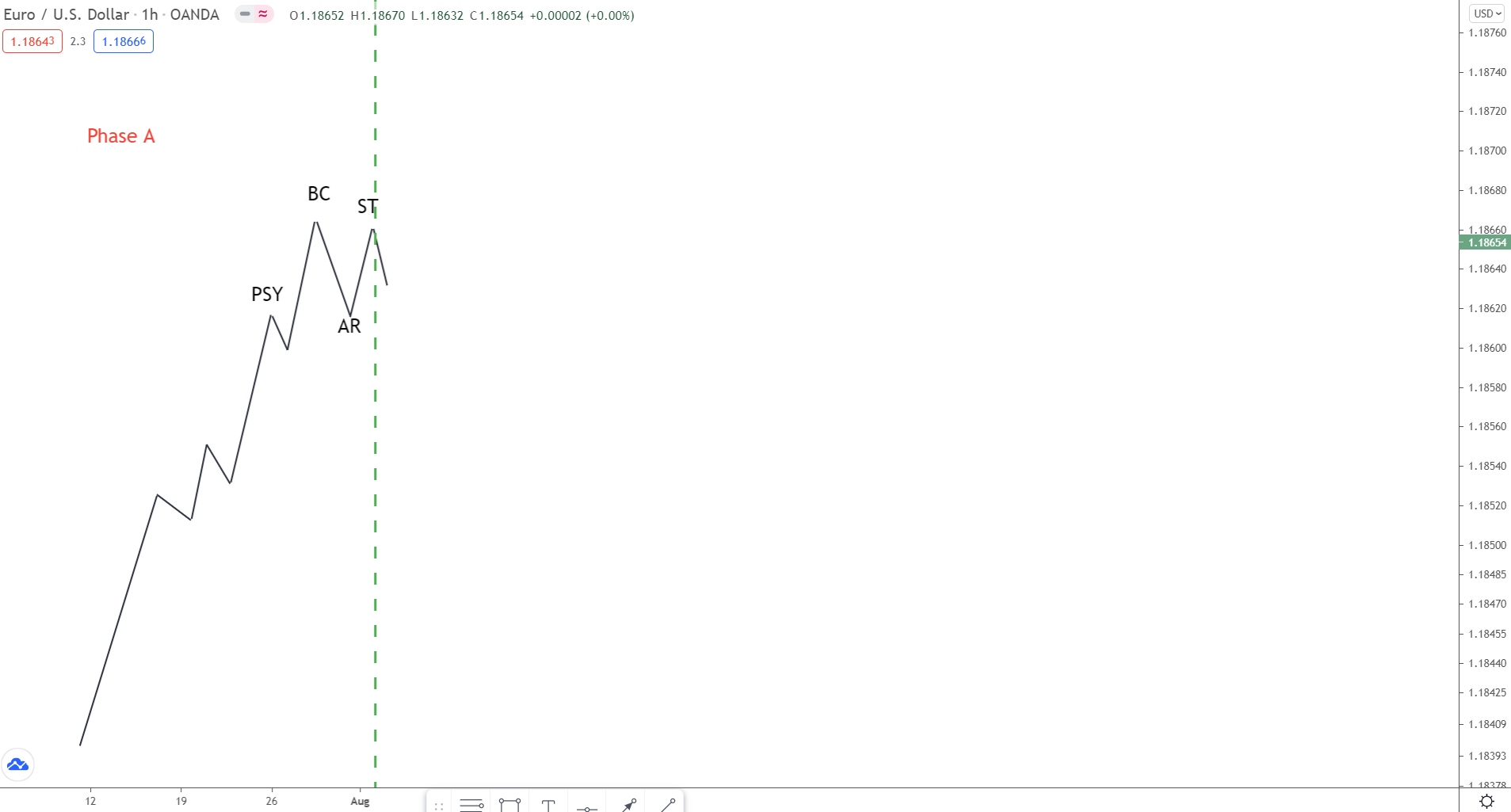
Always coming off the back of a long uptrend, Phase A begins when buying pressure decreases, usually accompanied by a drop in both volume and volatility. Evidence of sellers entering appears at preliminary supply (PSY), but again, this isn’t enough to indicate the uptrend is over.
During the next move higher, we see the buying climax (BC) established.
Here the buyers battle the sellers to push price higher one last time before running out of steam.
The sellers then take control, causing price to fall, resulting in the buying climax.
Volatility and volume will usually increase here.
After the buying climax, price falls sharply.
We call this the automatic reaction.
The huge demand from buyers has been absorbed by the sellers. Not enough buy pressure exists to push price higher anymore. As a result, price must fall to find more willing buyers.
After falling slightly, buyers jump in again.
Now we see a secondary test (ST), culminating around the buying climax.
Again, the sellers absorb the buyers, resulting in price falling.
This is when phase B begins…
Phase B
In Phase B, we see price consolidate as the big players slowly sell their holdings to initiate the markdown (downtrend) phase later on.
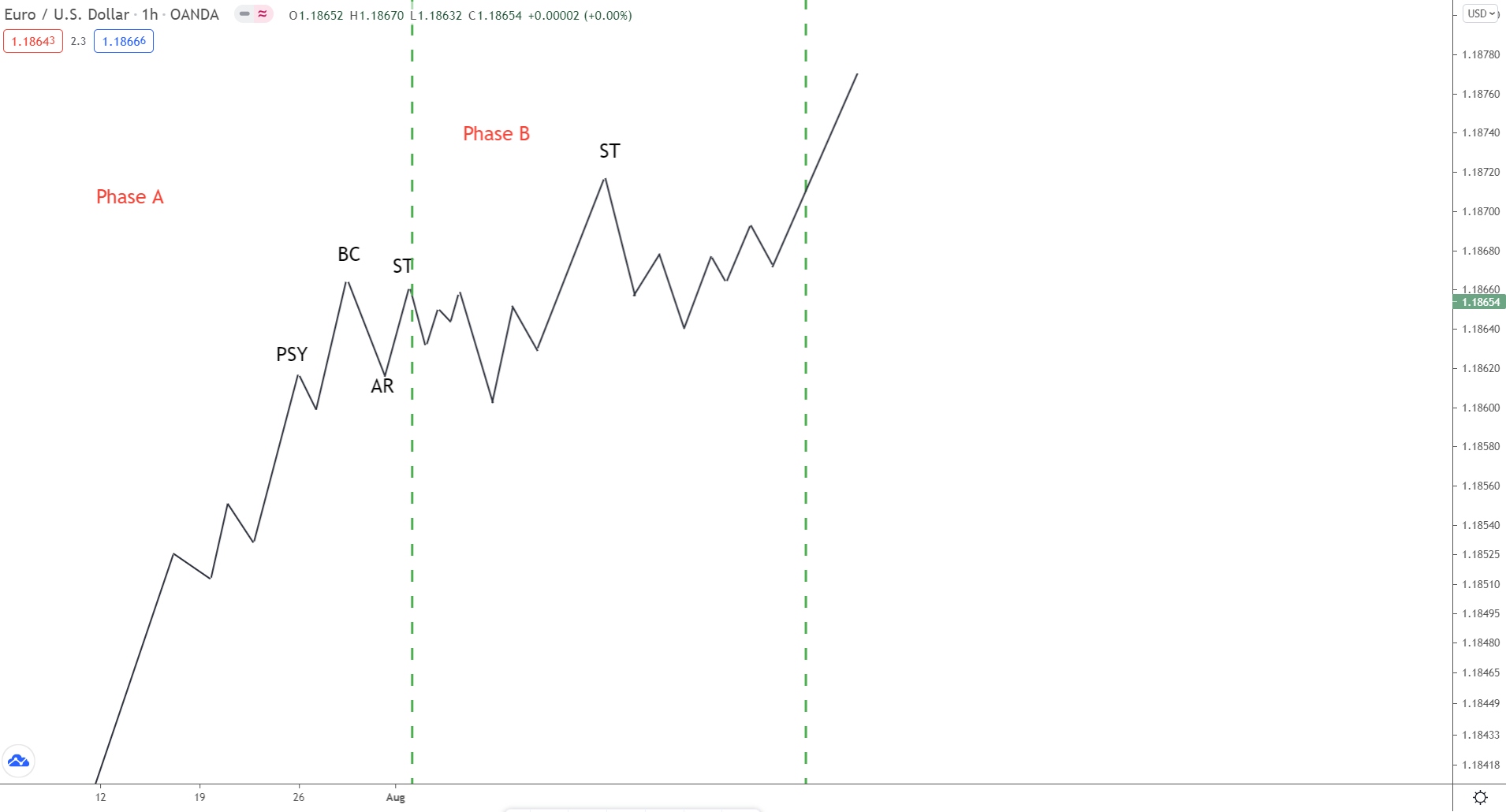
Multiple secondary tests and false breakouts can occur here, with many usually spiking above or below the upper/lower bands of the consolidation. Like all schematics, the structure of these phases will never appear the same but will always follow the same order.
Sometimes, price will spike above the resistance level formed by the BC.
Here, you’ll see an ST form which can also be called an upthrust (UT).
Occasionally, price will also form a supply zone at the secondary test (ST), which can provide a nice short entry into the final phases.
Phase C
Like the accumulation phase, the big players will often initiate one last trap before the final phases get underway. These shake out any last remaining weak holders and allow the big players to enter more sell trades before markdown.
This trap is referred to as UTAD or Upthrust after distribution.
It is the opposite of the spring we see during the accumulation phase.
Phase D
Phase D marks the point where the consolidation ends, and the markdown phase begins.
After we see the bull trap (phase C), price starts to fall. Around moving back to the halfway point of the consolidation, the last point of supply forms (LPSY), creating a lower high.
If price rises, this provides resistance to the move higher.
When price moves lower, the move should break the support levels formed by the automatic reaction rises we saw during phase A. This is considered a sign of weakness (SOW) and indicates the markdown phase is likely underway.
Phase E
And finally, we see phase E – the beginning of the markdown phase (downtrend).
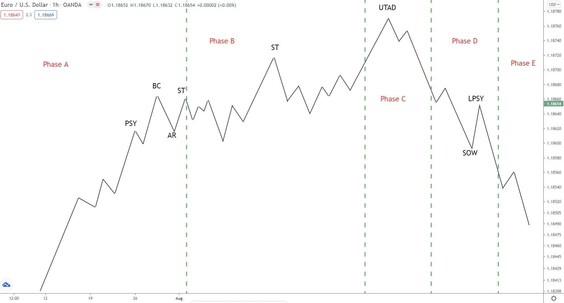
Here, price breaks below the trading range, confirming the new downtrend is underway.
Supply now totally outweighs demand; the big players have entered short and want price to continue falling going forward.
Wyckoff’s 5-Step Trading Approach
Alongside his many principles and ideas, Wyckoff also developed a 5-step approach for trading the markets using his concepts.
These steps provide clear guidelines on analysis, asset selection, risk vs reward ratio, and entry. Combined with the market cycle and accumulation/distribution schematics we looked at earlier, these steps can help you implement Wyckoff in your own trading.
Now, keep in mind…
Nowadays, many of these steps are outdated.
And some don’t really apply to forex trading.
However, to help you out, I’ve left my own translation of each step below, so you know what they really mean and how to use them in your own trading.
Here’s each step in detail…
Step 1: Determine the trend (on your trade timeframe)
Translation: Determine the trend on your trade/analysis timeframe.
We all know to determine the trend – it’s price action 101.
But you should only follow and determine the trend on your trade/analysis timeframe… NOT the overall trend the market has been in over the long term. Because in many cases, the long-term trend will be totally different to the short-term trend.
For example:
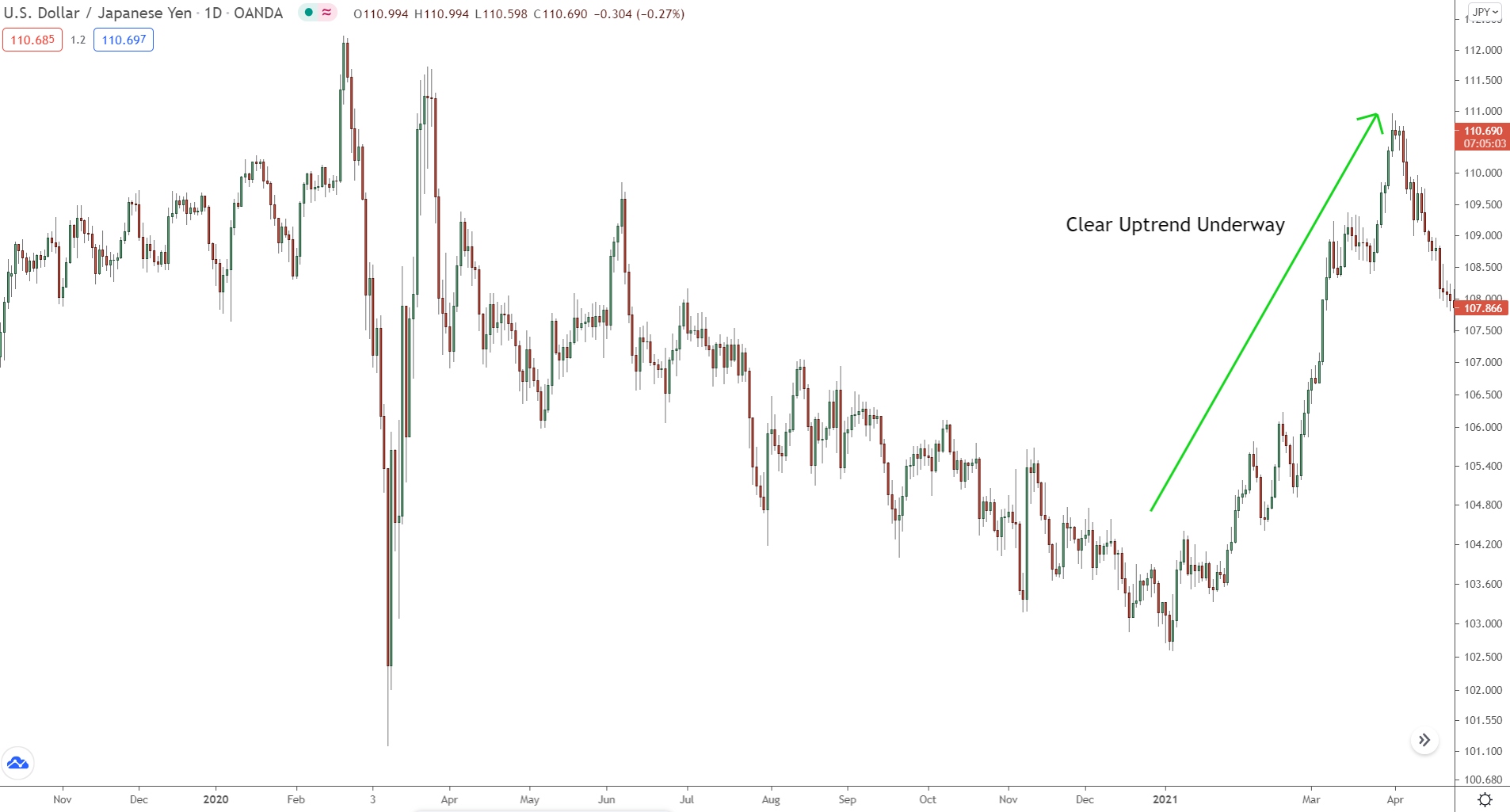
On the daily, the overall trend might be up.
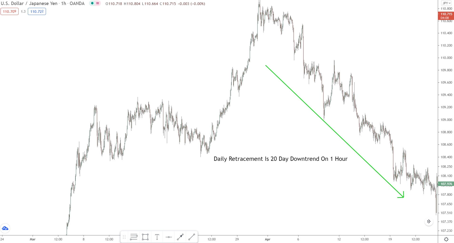
But on the 1 hour, price could be in a large retracement.
In that case, the daily (long term) trend is up while the 1-hour (short term) trend is down.
If you trade with the daily trend now, you’ll be trading against the 1-hour trend.
The result most likely being a string of losses.
Remember: always trade with the trend on your trade/analysis timeframe.
Keep the long-term trend in mind but pay more attention to your trade/analysis timeframe trend. Being recent, the data is more up-to-date, and so gives you closer a look at what’s really going on in the market.
Step 2: Determine your pairs strength
Translation: how strong is one pair compared to another.
More of a guideline than a cold hard rule, check how strong the currencies in your selected pair are against one another before trading.
Strong currency vs weak currency = strong uptrend.
Weak currency vs strong currency = strong downtrend.
Personally, I don’t follow this rule myself…
It’s more applicable to stocks than forex, which is what Wyckoff initially created his method for.
Nonetheless, it can give you some nice insights into trend strength, so you know which pairs to trade.
Step 3: Look for assets with sufficient Cause
Translation: is the risk/reward ratio favourable?
When weighing up any potential trade entry, always analyse the risk vs reward ratio.
Will you generate a large profit if price moves as expected?
Does the reward justify the risk?
It’s all too easy to get sucked into a trade idea because it looks good even though the risk far outweighs the potential reward.
For me, a trade idea must generate at least 3 times my risk.
Any lower than that, I pass… too risky!
At a 1-3 ratio, I make 3 times my risk. Over many trades, that allows me to withstand multiple mistakes and losses, providing me with more safety and decreasing my risk significantly.
All major benefits that improve my trading.
Step 4: Determine how likely is the move
Translation: what are the odds of price doing as you expect?
If the risk vs reward ratio checks out, the next step is to gauge how likely it is for price to actually do as you expect. You want the highest odds that price will move in your favor and generate a profit for your trade.
That means…
Checking for confluence,
Analyzing the current trend, and,
Seeing if your trade idea generally makes sense.
If everything aligns, price probably has a strong chance of acting as expected. You can enter your trade with the knowledge that price has a high probability of moving in your favor.
Step 5: Time your entry
Translation: has the right entry signal formed?
The entry can make or break a trade idea, which is why you must always time your trade correctly by waiting for the right entry signal to form.
Far too many traders rush their entry… they’re too eager to get in!
Rather than wait for the right signal, they enter way too quickly.
The result usually being drawdown or a small loss.
Before you enter, always WAIT for the right signal. Whether that’s a pin bar, engulfing pattern, or some other technical analysis signal, it doesn’t matter.
You MUST wait for the right signal to appear.
DO NOT enter out of boredom or hastiness.
Much better to miss a signal than enter too soon and end up with a losing trade. Or suffer massive drawdown before the trade eventually becomes successful.
Summary
In conclusion, Wyckoff’s work offers an invaluable framework for understanding market behavior and decoding the strategies of the big players. His principles and concepts equip you with the tools to make more logical and informed trading decisions. By recognizing the different phases of the market cycle, you gain a significant advantage in anticipating reversals and the birth of new trends.
Embrace Wyckoff’s wisdom, and you’ll not only boost your profitability but also develop a deeper understanding of the forces that shape the markets. It’s a win-win situation!
The Takeaway
Wyckoff’s schematics provide a framework for understanding market behavior. Even if events don’t unfold in a perfectly linear fashion, knowing the typical patterns and their implications can help you stay ahead of the curve.